A/B Testing, Navigation, Surveys, and Other Aspects of Web Development in Minneapolis, MN

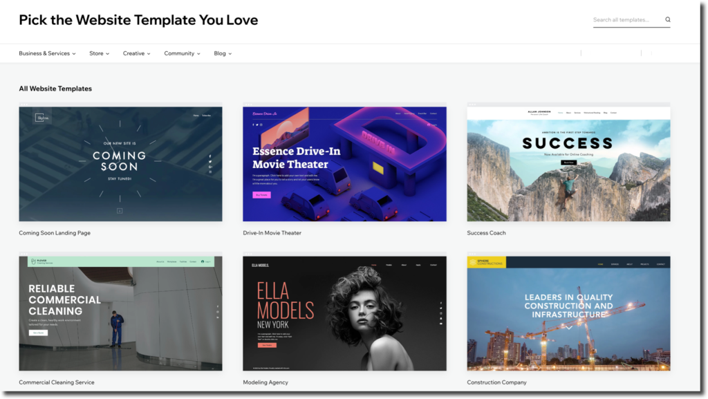
Building a website requires taking a LOT into account these days. Web designers need to go far beyond the aesthetics and general blueprints of a site to gain the favor of Google and other search engines, provide a quality user experience, and grow a brand audience. If you are working with an existing website rather than building from the ground up, that process can get even more difficult. Following Google’s recommendations for good search engine ranking and conversion rates can be helpful, but when you run into advice like “build a responsive website,” that guidance falls a little short. Of course, it’s a great idea to build a responsive website that fits perfectly into any screen size and resolution a user may be looking at, but that process is much easier said than done. Responsive web design requires some serious background knowledge and development skills, in addition to the ability to build in future updates easily. Most small brands and companies don’t have the time or team to build responsive web design into a new site or an existing one. Instead, the support of a third-party marketing firm and web developer can give your website the boost towards Google recommendations it needs. MLT Group provides comprehensive services for web development in Minneapolis, MN, in addition to marketing, SEO, social media, graphic design, and video production resources.

Web Development

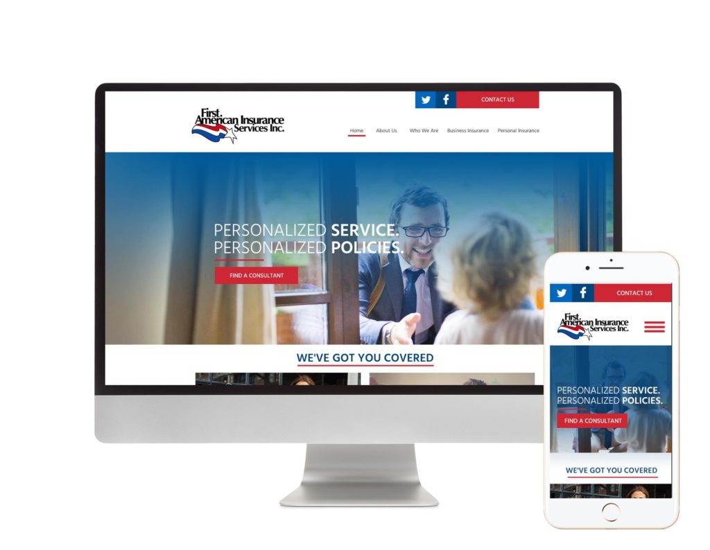
Responsive web design essentially means a developed site can respond to user actions and the space they’re in, including the screen size, resolution, platform, and orientation. Some companies create separate websites just for desktop, mobile, and other screen displays. Others may create apps that work in tandem with their desktop website, or an intelligent website that can shift between different environments.

Web Development Using Web Design

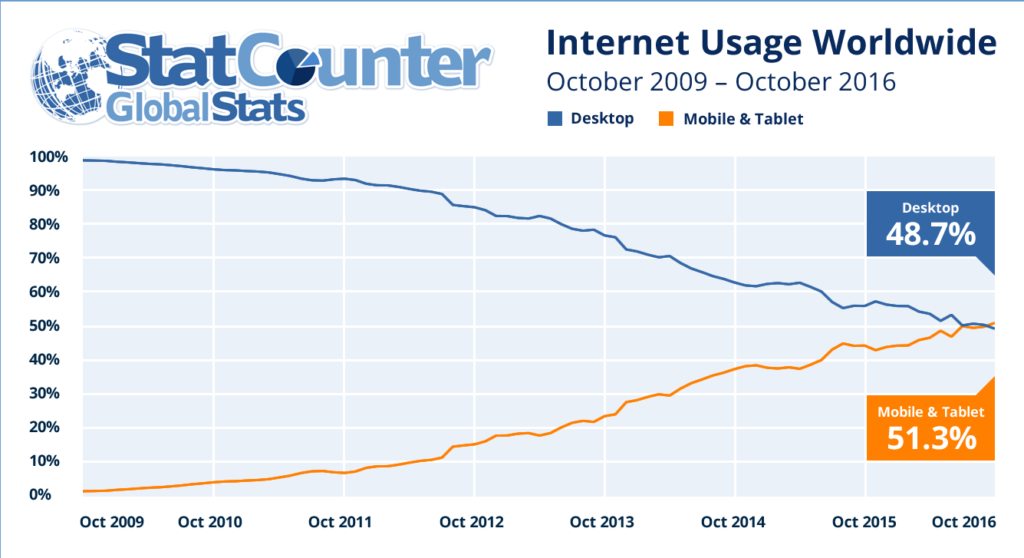
However, building that kind of high-performance web design isn’t a possibility for everyone. It can be time-consuming, expensive, and difficult. A 2008 study identified screen and resolution averages among about 400 devices sold since 2005, and the range in those numbers is immense. Because more devices with different formats have come out since then, you can see how broad the idea of responsive web design can get.

While we’re able to provide services that support your responsive website design goals, there are also a lot of things you can do to improve the user experience (UX) and your site design in general without a complex overhaul of mobile, desktop, tablet, and other screen response. Some simple ways to start improving your website design come with a better understanding of user intent and the user experience with your site.

Web development that improves the user experience requires you to do some research that gathers numbers and other information for a solid start. Some ways you can get that important feedback are with A/B testing, surveys, and other tools.

A/B Testing

Also referred to as “split testing” or “multivariate testing,” A/B testing is a way to conduct randomized, controlled experiments with your website’s content. The goal of an A/B test is to determine the effectiveness of a website component. Tests of components take a control/original part and operate with a variation of that part. Users are directed to either the control or the variation, and you can begin to track the interaction results with both A and B. When you gather enough information with this experiment, it can either lead you to make positive changes on your site or to conduct another test to gain even more insight.

A/B testing can be done with virtually any component of your website, from media content to navigation menus. Users are not made aware they are part of this test, so the information you gather is unbiased and does not impact your audience negatively. A/B testing is a recognized marketing tool that is most frequently used to gauge user interactions with signup forms, registration systems, and other calls to action. This form of testing helps you see information that was initially subjective in an objective way, turning guesstimates into numbers.

There are various ways to perform A/B testing, usually through a third-party system designed specifically to help website owners gather information. Our team can also perform any A/B testing processes you need to gain marketing data for each part of your site and receive reliable returns on investment (ROIs).

Web Development for Surveys

The best way to find out what users want or to see what they think about something is to ask them. All kinds of brands use surveys on their websites as active information gatherers that can operate for as long as they are still effective. Surveys are most helpful for websites just starting out or turning towards more responsivity and better UX. You don’t have to bug your users with continually popping up surveys, but a simple survey that asks users what they are looking for and how their experience is going will give you a lot of insight into how your target audience operates. Some great questions to put into survey format on your site include:

  • What did you come to this site to do?
  • Are you finding what you’re looking for?
  • How much does product price matter to you?
  • Does blank feature matter to you?
  • Do you trust this product/information?

There are hundreds of other questions you can ask your users, but it’s better to ask simple questions that they can answer quickly. With simple questions that can provide large chunks of information, you will likely get more user interaction with your survey and therefore a greater depth of feedback. Surveys can give you feedback on user intent, user experience with your site, patterns in behavior, and the overall responsiveness of your website.

Web Development of Navigation

The most important part of a website’s responsive design comes with user navigation. You can build in glamourous, bold, and dynamic features, but when navigation gets lost in your web design, quality and effectiveness are immediately decreased. One of the most popular trends on websites today is the use of hamburger menus. Hamburger menus are those little icons that are often in the left or right-hand corner of a site, most often with three bars inside a box. It gets its name because it resembles a hamburger (bun, meat, bun). While these menus are becoming more recognizable because they’re so often used these days, keep in mind that not everyone will know what they are. The standard three-bar icon is a well-known menu indicator, but many stylized versions are confusing. In fact, because some hamburger menus have such low visibility (some are incredibly tiny) and because of their ambiguity, they can lead to a loss of navigation for some users.

Functionality Vs Flash

In addition to hamburger menus, more and more companies are trading functionality for flash on their websites. While you can definitely have flash and a well-developed brand aesthetic as a key part of your website, you should never sacrifice navigation factors for cosmetics. If users can’t negotiate their way through your site, your conversion rates will go down, traffic is more likely to click away, and you will lose authority as a brand. Another reason you should solidify your site’s navigability before attempting to add in lots of dynamic visual content is because it’s a component of responsive web design. When your site is shrunken, expanded, stretched, and otherwise altered as it’s displayed on different screens, navigation should still be there for users. Adding in flash can complicate that responsiveness, and it’s more likely to jumble the rest of your site content when it switches between screens.

Summary

There are many other ways you can improve your site without having to do a full retrofit to make it more responsive, but these are some effective first tools to try. If you’re working to build a website, grow your brand, or make changes to your current website for greater responsiveness to user behavior, we can help. Contact MLT Group today at (507) 281-3490, sales@mltgroup.com, or online for more information about web development in Minneapolis, MN.


How the Google Algorithm Has Changed Over Time and What It Means for SEO Web Development in Minneapolis, MN

Since its beginnings in 1998, Google has dramatically changed the way users can search for information, ask questions, and find resources. The internet itself has also transformed significantly as technology, website capabilities, and user goals change. If you have a website, you probably use some kind of search engine optimization (SEO) tactics to improve your Google ranking over time. No matter how extensive your use of SEO systems is, you should be aware of any changes that Google makes to its search engine algorithm so you can work accordingly. There are frequent changes to the function of the Google algorithm and the ways websites can optimize their rankings. Google makes small adjustments to its algorithm multiple times every year, but the big changes that completely change the SEO landscape happen less often. If you’re hoping to improve your website’s Google ranking with better SEO but aren’t sure where to start, we can help. MLT Group LLC provides complete digital marketing services, including SEO web development in Minneapolis, Rochester, and everywhere else.

Web Development

According to market research, Google dominates with a 90% share of the global search traffic, while Bing and Yahoo only hold about 3% and 1.3%, respectively. This means that most of the rules of search engines are established through Google’s algorithm. When that search algorithm changes, the SEO rules change with it. There are many reasons why Google has made adjustments to its algorithm over the years, but each change was made with the main goal of improving user experience and better answering user inquiries.

Google in Web Development

The Google algorithm still performs its three basic tasks of crawling, indexing, and ranking. Google has, however, made adjustments over the years to how your website’s data is prioritized in the crawling process, how websites are indexed, and what sites are ranked highly on a search engine results page (SERP). If you’re using SEO tools, it’s important to keep an eye on Google news and updates to see if major changes might warrant significant alterations to your marketing campaign. SEO web development has been mostly the same since the last big change in 2015, but Google still makes changes to its algorithm upwards of ten times a year. You can keep an eye on these changes when Google announces updates, but most of the time you won’t have to adjust your overall SEO strategy to accommodate a completely new search system.

SEO Strategies in Web Development

Despite Google’s changes being mostly minor, the time may come soon when users’ social patterns, technology, and content purposes alter the search engine and SEO landscape. Even without large changes, it’s important to be aware of effective and current SEO strategies. Some marketing staff are still working with out-of-date SEO tactics like keyword stuffing and link manipulation.

Blog Posts

You can learn more about good, current SEO basics and the SEO tools you should avoid in this blog post, but to get an idea of how we got the SEO developments we have today, let’s focus on changes to the Google algorithm throughout recent history.

Panda: February 23, 2011

The Panda update began in 2011, but with over 28 updates over the years, it’s still highly relevant for SEO. In fact, the full Panda update was rebuilt into the base of the Google algorithm by 2015. Panda was developed to improve content quality, better answer user inquiries, and get rid of content farms. Around 2010, there were growing issues with a high output of thin, poor, and duplicate content. This content was generally farmed by websites that used it as cover ups or placeholders for advertisements and spam. Panda also targeted user-generated content of low quality or content without a purpose. Google’s mission with Panda was to eliminate content that was unnecessary and punish sites using black hat SEO practices to manipulate the system. The first impacts of Panda affected about 12% of search results (in English).

Panda has several triggers in its algorithm that will catch websites using unwanted SEO practices. Sites that use those methods will be ranked very low, if at all, on SERPs. Some triggers include low quality content, content farming, high ratios of ads to content, low quality user-generated content such as poorly written or inaccurate blogs, content made by unverified sources, mismatched content, sites that users have blocked, and duplicate content. Generally speaking, your site won’t be penalized by the Panda algorithm update if you are making quality content and using approved SEO practices.

Penguin: April 24, 2012

Soon after the effectiveness of Panda was seen, Google released the Penguin update in 2012. Unlike Panda, which penalizes sites with low-quality content, Penguin was meant to reward sites for making good content and hosting a high-quality website. It was also meant to reduce search results that included sites using link manipulation and keyword stuffing. The first incorporation of Penguin into the Google algorithm impacted 3.1% (in English) of search results. There have been 10 updates to Penguin over the years, and in 2017, it was brought into the core algorithm. The first four years of Penguin showed a severe impact on penalized sites. It was so difficult for sites hit by Penguin to recover that the code was almost completely reversed in 2016. Now, Penguin mostly works to devalue links that are low quality and link networks.

The main triggers of Penguin are link manipulation and keyword stuffing. Link manipulation means a site has built or purchased backlinks from low-quality websites or unrelated sources. This link scheming makes a website look more popular and relevant than it actually is. Keyword stuffing used to be an effective white hat SEO practice, but Penguin changed that. Websites that stuff excessive amounts of repeated keywords into their content are confusing and awkward to read. Google now considers keyword-stuffed sites a mark of poor quality.

 Pigeon: August 20, 2013

 In 2013, Google released several updates all at once, including Pigeon and Hummingbird. Pigeon dramatically changed the local search algorithm, connecting it more directly to the core search engine algorithm. This affected the way local and organic results end up ranked on a SERP. Not only did it make it more important for local businesses to have an organic SEO presence online, it also adjusted the way distances and locations are calculated for users. Search radiuses were narrowed to the location of the user rather than the larger area that a search query could suggest, which made it harder for local businesses to compete in the smaller groups of SERP rankings.

Pigeon also changed the “pack” display of local search results for the user. The pre-Pigeon method of showing local results was in a pack of 7 businesses listed by name and link. With Pigeon, that was changed to a pack of 3 businesses listed by their location on Google Maps and below in a list of links. Pigeon was one of the most significant changes Google has made to the local search algorithm.

 Hummingbird: August 20, 2013

 Along with Pigeon, Hummingbird was also a new update to the Google algorithm in 2013. However, Panda, Penguin, and Pigeon were all add-ons to the core algorithm, but Hummingbird was a complete remodeling of that core. After Hummingbird, there were many conditions of the old algorithm that stuck around, but the entire system was adjusted to pave the way for a more intelligent infrastructure that would adapt continually to the future.

Hummingbird established a growing understanding of user intent and the ability to provide results that would better meet their needs. Hummingbird’s algorithm uses synonyms and other semantics to understand human thought processes, marking the beginning of Natural Language Processing (NLP). In search engine terms, NLP means the Google algorithm can process a full search written in natural language, like “What is the healthiest kind of sushi?” rather than just simple search terms like “healthy sushi.” It’s also a beacon of the kinds of Machine Learning (ML) that Google is developing to make its search systems smarter and better at their jobs.

Rankbrain: October 26, 2015

In 2015, some of Google’s earliest ML algorithm components were introduced with Rankbrain. Although Rankbrain has been a component of Google’s core algorithm for several years, it’s a highly complex system that is still difficult to understand. Essentially, Rankbrain uses machine learning that self-teaches through data inputs to improve the selection of results on SERPs. Like other algorithm updates, Rankbrain is meant to make the user experience better and find the most relevant results to answer a search. Unlike the others, though, Rankbrain is able to adapt to and understand user intent through its machine learning capabilities.

Sites are generally not negatively affected by either the Hummingbird or the Rankbrain updates to the Google algorithm. Both are meant to simply make the core algorithm smarter and more self-sufficient for the long term.

These are just a few of the many updates and changes that have been made to the Google search algorithm over time. If you’re working with SEO tools but find you need assistance adapting to algorithm changes, MLT Group can help. To learn more about our work with web development in Minneapolis, MN, contact us at (507) 281-3490, sales@mltgroup.com, or online today.

Why a Custom Website is Better for Your Brand’s Web Development in Minneapolis, MN

web-development-minneapolis

There are many ways to build a website today. It can be as simple as using a free website template provider or as elaborate as writing your own HTML, Java, Python, or other type of web development code. Depending on your budget and level of investment in a website project, some of these methods may be better than others. For the majority of public figures, small brands, and other websites that only require the basics, website builders like Squarespace and Wix can work just fine. While these templated website builders can offer adequate solutions for those looking to stick with a pared-down, attractive site, they are often too limited for businesses or brands looking for more dynamic options. If you need anything that website builders don’t offer, or expect your site to grow into something more unique in the future, the best option is to take advantage of custom website building services. At MLT Group LLC, we help companies and brands create innovative, high-functioning websites with our services for SEO marketing, design, and complete web development in Minneapolis, MN.

Comprehensive Marketing

MLT Group offers comprehensive marketing and design services, including SEO strategies, digital marketing campaigns, web and graphic design, social media marketing, and video production. Our mission as a third-party marketing firm is to help clients achieve their content goals and sustain long-term success as an online presence.

Website Builders

The number of website builders available to a wide range of individuals, brands, businesses, and content creators has grown exponentially in the last five years. Template-based website builders like Wix, Squarespace, and Shopify make building a quality website attainable for those without coding skills or a budget they can use to pay a third-party website builder to create from the ground up. These sites have many benefits, and they’ve been integral to thousands of small businesses establishing their online brand.

As of 2021, Squarespace has about 3.8 million subscribers with a starting price of $16 a month for personal sites, and Wix has about 200 million subscribers and offers a free template program in addition to their more expensive upgrades. Website builders like these are great systems for building nice-looking, simple sites that can incorporate basic e-commerce with added costs.

If these capable systems are available for such low pricing, you may be wondering why any business would utilize custom websites that are built either in-house by their own marketing team or built by a third-party builder. Despite their many benefits for quick, low-cost, and generally well-designed sites, these template systems have significant drawbacks for brands that want to give themselves room to grow into prosperity.

The Benefits of a Custom Build

When it comes to quality web development for your business, you shouldn’t have to waste time or money on a unique website that fits your brand’s aesthetics and offers peak performance. Even if you own a small business, it’s worth it to invest in a custom website that you can take with you as you grow your brand, instead of using that energy and expense now to create a template-based website that will limit you down the road.

web development

Templates Limit Design and Future Growth

Custom websites are not limited by the template system that website builders like Squarespace and Wix use. The templates those builders use are generic outlines that, while they offer some customization options, often end up resembling many other sites out there. If you rely on website builder templates, you could even have a site that’s similar to one or more of your direct competitors. Website builder templates also limit the functionality of your site in addition to the aesthetic design. Most of these templates don’t allow growth for added marketing tools like multi-faceted blog integration, distinctive e-commerce systems, and custom calendars.

Custom Sites Have Better Integration

Custom websites can also integrate with almost any service that has an API (Application Programming Interface). Some website builders do allow for basic integrations of services, but these are very restricted capabilities. Again, the templates will limit your ability to integrate new features and tools into your site. If you are using one of the many website builder templates and you attempt some integration, it could jumble your entire site. Custom sites are built to work with all exterior integration via APIs, so you can continue to make your online presence more dynamic with a richer site.

 Custom Sites Have Better Mobile-first Designs

Another benefit of a custom site is the ability to completely control the way your website looks on a desktop or a mobile device. Every website should have full functionality on both device screens, since most people access sites on both platforms today. The largest issue that website builders have with mobile device translation is handling content blocks. As text, images, and other content sections are relayed into a mobile setting, they tend to stack and jumble in ways that are difficult for users to process. A custom site can go beyond the simple translation of a desktop website display into a mobile device. Instead of mirroring into a mobile format, custom sites can contain two distinct programs for the larger landscape screen of a desktop and the smaller portrait screen of a smart phone or other mobile device.

Website Builders Limit Multi-Development and Staging

Website builders like Wix and Squarespace do allow you to build your site, make changes, and see the final product before it’s published for the world to see, but those development stages and detail work-outs are much more limited than when you build a custom site. Custom-built websites can spend much more time in multi-tiered development environments while each aspect of the site design is staged, tested for functionality, and meshed with each other. Since custom sites often allow for greater complexity and higher system capabilities, this development and staging time is a critical component of the quality control process.

Custom Sites For Web Development Can Grow with You

The simplicity, ease, and cost of a website builder might look like a good option for where your business is now, but what about how your brand will grow in the next five or ten years? Your website’s functions should be able to grow with your company and continue to allow space for new marketing tools, e-commerce abilities, design features, and more. We can’t always predict the new technology that will be available in the future of web design, but custom sites built today are created on a foundation that’s set up for long-term growth and the integration of new internet rules, web design systems, and brand changes. For most small businesses, a website builder template can help you create an online presence now, but custom sites will give you that space for now and for the future.

Benefits of Custom Websites

There are many other reasons why a custom website is more beneficial to businesses of all shapes and sizes than website builder systems like Wix and Squarespace (including the fact that the accrued costs of a website builder subscription often equal the initial costs of a custom website set up), but these are just a few of the most significant points of interest.

If you’re considering working with a third-party marketing firm to build a custom website after reading this, we can help. MLT Group offers fully customizable web development in Minneapolis, MN, including building a custom website. Contact us at (507) 281-3490, sales@mltgroup.com, or online today to learn more.

4 Kinds of Keyword Research for Marketing and SEO Web Development in Rochester, MN

web development

Just as with many other technologies, the way search engines and web systems work changes over time. As recently as just a few years ago, Google and other search engine algorithms favored websites with saturated keywords and over-stuffed URLs. Today, those same practices are penalized. If you’re new to web development, it might be daunting to know where to start. Building a website requires a complex combination of design elements, relevant text and data content, keywords, search engine rule following, and more. To integrate the best search engine optimization (SEO) systems into your web presence, you have to follow the requirements set by Google, Bing, Yahoo, and other search algorithms to put your website on the map in terms of ranking. A higher rank on a search engine results page (SERP) will give your website more visibility, credibility, trustworthiness, and authority. One of the greatest tools available to website and content creators for both SEO and marketing purposes is the use of keywords. As a third-party marketing firm and provider of expert web development in Rochester, MN, MLT Group LLC uses a wealth of knowledge and experience to embed and implement the right keywords in the right places on your site.

Experts

Our web design, marketing, social media, and SEO experts, graphic designers, videographers, producers, and project managers offer comprehensive services to meet any of your online objectives. If you’re embarking on a web design process alone, however, it’s important to remember the usefulness of keywords.

Keywords

Keywords on your site will help lead search engines to your web pages, content, and media in many ways. Not only are keywords directly linked to various types of user inquiries, but they can also help you decide the most effective content to create, build marketing campaigns, and utilize social media effectively. Researching which keywords will be the most effective for your brand can follow several different paths depending on what purpose they will serve.

Keyword Analysis

The four main categories of keyword analysis include research for SEO and search engine marketing, research for social media marketing, content creation research, and research into specific audiences or market demographics.

Web Development

For web development objectives, understanding those four paths for keyword research can help you build content that better meets user needs and improve your Google ranking.

SEO and search engine marketing keywords:

This type of keyword research is considered “classic” investigation. Determining which keywords relate to your brand and overall website content while also meeting user inquiries will increase your SERP ranking. Some basic SEO keyword use could be the inclusion of a general search term with a location. For instance, if your website serves as an e-commerce retail space but you also own a physical store, you can benefit from the use of keywords specific to your products, online shopping terms, and your actual locations. To use an existing example, if a user searches “vintage band t-shirts in Rochester, MN,” they will see there is an online store featured at the top of the Google search results for Ragstock. A branch of this retailer is located in a Rochester mall, but it also provides online shopping for vintage band t-shirts and other clothing. Using keywords to match the most-searched user inquiries (whether those searches are information-based, navigational, or transactional) in relation to your site content is the primary way to improve your SEO results.

Marketing

Another use of keywords for SEO/marketing purposes, specifically for search engine-based marketing, is for targeted promotions and pay-per-click (PPC) advertising. The keywords used in these kinds of ads work similarly to SEO keywords on your actual website. Google and other search engines will rank ads that their algorithms find relevant to the user inquiry higher on SERPs. Paid promos and PPC ads related to keyword searches are also favored above organic results, often at the top of a SERP.

Audience and market research keywords:

You can also use keyword research to learn more about your audience or a specific user demographic. Using tools like Google’s Keyword Planner system, your own website’s analytics, or even through market research with various news media like Reddit, YouTube, Quora, and Google News, you can pinpoint what audiences are asking, buying, talking about, interested in, unhappy about, and more. With keyword research geared towards audience behavior, you can also determine demographics like ages, locations, professions, languages, and other information. Google Trends is another free system that allows you to search keywords to see their level of trending over certain periods of time. Using keywords relevant to your online brand that are trending across large audiences or are discovered for niche user sets can assist you in building a diverse and dependable following to market to.

SERP ranking

Using keywords for a broad audience (like “vintage fashion”) combined with more unusual or underground keywords that are still related to your content (such as “vintage 1950s letterman jacket”) can be one of the most effective ways to grow your audience simply through SERP ranking.

Social media marketing keywords:

Another extremely effective use of keyword research is determining social media trends and understanding how to use hashtags (and tags in general) accurately. If you have an online presence, it’s highly recommended that you also have at least one social media platform. Ideally, brands should utilize the broad reach that multiple platforms like Instagram, Twitter, YouTube, Facebook, Pinterest, TikTok, and Snapchat provide. Each of these social media platforms offers fully-developed “SEO” systems that use similar properties to actual search engine algorithms. These platforms index and rank accounts, tags, topics, and even images to best answer a user inquiry based on keywords and location.

Social Media Marketing

The trick to social media marketing is that each platform system is different from the rest. A trending post on Instagram won’t translate to video formats, and it may not hold the same attention on Facebook or Pinterest. Similarly, popular tweets reposted on Instagram and Facebook may actually be penalized for showing up as text content spam or advertisements that break platform rules. The best way to effectively use each social media platform’s keyword system is to spend time learning their various search systems and formats with the information applicable to your brand and audience.

Content creation keywords:

One rule of good SEO is to continue publishing fresh content that adds richness to your web presence, provides real information to your audience, and follows the rules of search engine algorithms. The pressure of creating new content frequently can make it difficult to plan what blogs or news to generate. That’s where keyword research for content creation can play a significant role in guiding your publishing path and answering your “who, what, where, when, why, and how” questions. Content creation will naturally intertwine with your overall approach to SEO practices, sharing your brand goals and getting results together.

Fresh Content

Although fresh content creation for the sake of staying prominent in the eyes of search engines is important, you can also use keyword research to determine other reasons why content should be made. For example, using content to grow email subscriptions, generate sales, partner with other brands, introduce new projects or leadership, and gain new certifications or authority over your work can all be important reasons for generating a blog post or even building a new web page. Using the right keywords in that kind of content will only make their release have a more effective impact on audience growth and SERP ranking.

Keyword research opens many doors to building your online presence positively. Whether you are building a brand-new site or enriching existing content, we can help. To learn more about the use of keywords for web development in Rochester, MN, contact MLT Group today at (507) 281-3490, sales@mltgroup.com, or online.

How Media Content Affects Your SEO and Web Development in St. Paul, MN

There are many aspects of web development that can be utilized to build a site with the information, tools, and aesthetics appropriate to your brand. Most websites use design elements that have become standards like dropdown menus, landing pages, contact forms, and other common features recognizable to users. Conforming to expected web design elements will make your website easier to use and can improve your search engine optimization (SEO) results.

Web Development

Busy company leaders often choose to hire the services of a marketing firm for development of their websites. MLT Group provides complete services for web development in St. Paul, MN and across the country, including SEO, graphic design, social media marketing, digital marketing, video production, and more. Our experts can build your website to follow digital standards and emerging trends while ensuring your site is attractive to search engines and users alike.

Quality User Experience

In addition to supporting your brand’s online presence and providing the type of information that will answer user inquiries relevant to your company, a quality user experience (UX) should be a top priority in all your web development processes. The initial step to achieving a good UX for your site is a fast load time. Many users will click away from sites that load slower than two seconds. You may have had successful SEO that brought your page to the top of a search engine results page (SERP), but if a user clicks on your site and it loads slowly, you’re likely to lose that interaction.

Ranking Highly in Search Engines

If you build your website to offer a user experience that makes information easy to find and your company easy to do business with, you will have made a great start. Additionally, developing effective SEO that gets your site ranking highly in search engines is key to bringing in targeted traffic. Site features that catch that attention of users and keep them interested while on your site can be useful as well. However, don’t overdue these as clean and simple is still highly desirable in most site designs and some fancy features like pop-ups and interstitials can be detrimental to user experience and search engine rankings.

Overlays:

Overlays are dialog boxes, images, videos, or other types of content that show up directly on a browser window. A common example of an effective overlay is a request for users to sign up for a newsletter or enter an email for a first purchase coupon. Most retail sites, news resources, and blogs will use overlays to prompt users to sign up to receive emails from the company’s newsletter or advertisement system. These often are not penalized by Google or other search engines, but if they compromise the UX, they can damage SEO. Many web developers will pay close attention to how overlays affect the UX on mobile devices due to the smaller screen space. If you use overlays, make sure they are easy to close, show up within a few seconds of your page loading, and don’t show up repeatedly once the user has closed the box.

Pop-Ups:

Thanks to spammy pop-up ads that were common with the early internet days, Google and other search engines do not award sites that use any pop-ups. If you have pop-ups, not only is it likely that users will have browser prevention that automatically blocks pop-ups, Google will punish sites with pop-ups by lowering their SERP ranking. Pop-ups are different from overlays because they show up when a new window is opened rather than over a page. Pulling up a new window in addition to the page clicked will alert Google to potential spam and security risks. Generally speaking, we don’t recommend the use of pop-ups.

Modals:

Modals are similar to overlays, but they require action in the dialog box before users can interact with the page underneath. Common modals include sign-in requests, requirements to enter birthdates to continue, requests to verify users are over 21, requests to accept or deny cookies, CAPTCHAs, and other legal or paywall specific content. If modals appear right after the page loads, aren’t repeated once the user has provided the requested action, and are easy to understand, interact with, and close, Google will not penalize the use of that kind of media content. You can run into problems when using modals for advertisements or if the visual content is spam-like. If you have to use a modal, make sure it is not taking away from the UX or slowing down the load time of your site.

Interstitials:

Some sites, like Forbes.com, for example, use interstitials. Forbes uses them to show advertisements for their sponsors on their landing page. Interstitials are essentially timed overlays that cover part of the screen for a few seconds when you enter a site. These interstitials, or “interstitial experiences,” will stop you from interacting with a page or cover a large part of the screen as you scroll down. Even though they only last seconds, they can significantly damage the UX, and most search engines do not favor websites that use interstitials. Large brands like Forbes can get away with using interstitial advertisements on their landing pages, but most sites will see a decrease in SEO when they use interstitial elements. However, interstitials can be used effectively in very limited applications. They may be useful in making a user stop and acknowledge something before interacting with your site or to add some fun elements to your site’s entryway (such as this “Species in Pieces” interactive exhibition site). If you plan to use an interstitial, it may be beneficial to offer users the option to skip the experience.

Improve the UX of Your Site

For each of these elements, there is a lot to consider when taking into account how they will impact your SEO. Primarily, if you can utilize these elements to improve the UX, you can deter the negative impact they might have on your SERP ranking. If your website loads quickly and meets the needs of user queries while incorporating any of these types of media, Google and other search engines will be less likely to penalize your site. Tracking bounce rates, conversions, and other evidence of positive or negative user reactions will help you analyze how these elements are affecting the UX of your site. Have a backup plan if you have to remove these elements due to poor user interaction results.

Site Speed

The timing of these elements is also important. Generally, these elements should appear right when your site loads and only for short periods of time (or as long as users want to engage). Some exceptions to this rule could include an overlay that appears after a user reads a page or adds a product to their cart. Installing these elements into your site should also not pose damage to the user experience. If users can’t click past an element, if an element appears untrustworthy, if it slows down your site’s load time, or if it jumbles the primary design and informativeness of your main site, you probably want to avoid incorporating these types of media. Keep in mind that even if you install these elements and they don’t result in a bad UX, Google and other search engine algorithms might penalize your SEO results.

To learn more about web development in St. Paul, MN and how different elements of design can impact your SEO, or to get started with our team of skilled content creators and marketing experts, contact MLT Group at (507) 281-3490 or sales@mltgroup.com today.

Features of an Effective Marketing Firm for Quality Web Development in Minneapolis, MN

Whether you own a company serving local customers or a brand recognized internationally, having a website with user friendly tools, in depth information about your brand or business, and a unique design aesthetic are all key factors in digital marketing success. There are many ways to build a quality website yourself, even with minimal development knowledge, including with the many web building services available today. However, these web builders can cause design issues, create functionality roadblocks, and may lack in search engine optimization (SEO) tools. The mid to high cost for web builder services at top tiers may not be worth it to many brands. Small marketing firms in your area often compete with web builder costs while providing a better range of services, flexibility, creativity, and overall greater level of care. MLT Group LLC offers comprehensive services for web development in Minneapolis, MN and the Upper Midwest, including digital marketing, SEO services, social media marketing, graphic design, video production, and web design.

Effective Web Development

There are many properties of effective web development, and while many technical aspects of web design may shift with time (such as Google and other search engine algorithms), there are several core values that remain largely constant. Even with more and more cookie cutter web builders coming onto the market, there are still many reasons to work with an independent marketing agency.

Cookie Cutter vs. Custom

Web builders rely on templates that make it easier for anyone using their services to build nice looking websites quickly. However, these templates tend to become cookie cutter examples of excessive website conformity. The first problem with template or cookie cutter websites is that they are not unique. Many other brands, including your competitors, may use the same web builder services and templates. If your website starts to look the same as others, the creative and innovative aspects of your company may be overshadowed by the conformity of your site design.

Website Functionality

Another issue with cookie cutter websites is their functionality. Templates provided through web builder services may not include unique tools for media incorporation, ecommerce, and other custom needs. Additionally they often don’t give you options to accurately manage your SEO performance. Cookie cutter sites often offer some SEO tools, but without the ability to fully tailor to your specific brand’s SEO requirements. Some brands need ecommerce SEO emphasis, while others might need SEO that increases readership of fresh content.

Templates

The templates offered through web builder services may be easy to use to a point, but if you don’t have any web design expertise, you’ll struggle in the confines of your selected template. By outsourcing your online development process to an affordable marketing firm, you’ll be able to expand far beyond the limitations of templates. The goal of a marketing firm is to customize your website and marketing campaign every step of the way, giving you ownership over your brand and web presence that a cookie cutter website cannot accomplish.

Small Firm Effect

There are several ideas behind the concept of Small Firm Effect. Firstly, small businesses exist for a reason. They are serving a purpose that larger companies are not able to provide, and their continued success is evidence of this fulfillment. Secondly, small market capitalization has a tendency to outperform large market players, partly because they offer more boutique, quality services. Small companies are able to thrive with a quality over quantity approach to business, much the opposite of large corporations’ usual inability to provide the level of service quality that small firms can. Because they can’t provide a boutique level of quality, larger companies rely on quantity over quality.

Smaller firms can offer better quality services because they are more flexible and nimble to changes in projects or markets, their smaller staff is more attentive to customer needs, and with fewer projects on the schedule, they can spend more time and energy on precision and tailoring. Small companies can also focus on locally targeted content and become a part of online or physical communities.

SEO Marketing

Effective SEO tools will place your website in higher rankings on search engine results pages (SERP). Search engines like Google, Bing, and Yahoo use crawling bots that scan the content, data, security, and other aspects of your website pages. They will then index that information and rank sites based on how positively and accurately they answer a search query according to the search engine algorithm. Algorithms change over time, but many core SEO practices stay relevant for long term use. One example is backlinking. Backlinks have survived as a potent ranking factor despite the banning of many backlink related spam techniques. An example of an outdated SEO practice is keyword stuffing or overloading the use of keywords in your text content. A change that is coming in SEO marketing practices is Google’s launch of their Page Experience signal system. These new SEO guidelines are geared to favor websites with strong user experience metrics, including fast load times, interactivity, and balanced visuals.

Pay Per Click

SEM marketing techniques like pay-per-click (PPC) advertising and Google Ads can be effective, but nothing beats SEO practices for positive results and cost effectiveness. The strategic use of keywords and multimedia, installation of metadata, URL building, continued release of fresh content, and increased accessibility for a broader range of users will all play a significant role in improving your SEO. Our team of SEO experts, freelance writers, graphic designers, and video production staff combine forces to make our customers’ websites soar to higher ranks on SERPs.

Social Media Marketing

Another aspect of effective web marketing is the use of social media platforms to promote your brand and grow your audience. Having multiple social media outlets for your company might seem like a lot of tedious work in order to build hashtags, create well designed visual content, and write strong captions, but there are ways to streamline the process. The best social media presences will have a team dedicated to running on mainstream platforms like Facebook, Instagram, and Twitter. Social media marketing campaigns can see even further audience growth by creating video content for platforms that are expanding the internet in unique ways, such as TikTok and Snapchat. If you can’t afford your own social media marketing team you can still get a whole team working for you by contracting with an agency like MLT Group.

Improving Social Media

To get started improving your social media marketing presence, there are a few basic steps you can take. Or have experienced digital marketing pros help you with these steps.

  1. Establish your ideal customer and target audience. This can include demographics like age, location, income, social media presences, job titles, and aesthetics.
  2. Examine your current presence before determining the next steps forward. Pinpoint which platforms and networks you are the most important to your target audiences and optimize your presence on those accounts with clear photos, descriptions, bios, and URLs.
  3. Make a messaging that is a constant across all your social media platforms and your website. This messaging should explain to your audiences the values of your brand and help build trust with potential and existing users.
  4. Calculate your key performance indicators (KPI). Social media analytics often provide metrics that work as KPIs, such as likes, shares, conversion rates, brand shout outs, sentimental feedback, time spent on each platform, and post reach.
  5. Create fresh and engaging content on a regular basis. Social media is a great space to humanize your brand, show what’s going on “behind the scenes,” and overall build a fun and interesting environment beyond the professional aspects of your website. You can also use your platforms to curate other brands; content and outreach to build relationships with like-minded companies.
  6. Track your data, analyze results, and use this feedback to continually optimize your social media marketing practices. Social media platforms are the best spaces for trial and error because of their low cost and ease of content production.

If you also utilize ecommerce as a primary part of company operations, pairing those online sales tools with SEO, social media, custom site design, and the support of a boutique firm will help your brand grow and build a dedicated audience with strong user relationships.

To learn more about our services for web development in Minneapolis, MN and across the country, contact MLT Group at (507) 281-3490 or at sales@mltgroup.com.

2022 Web Design Trends in Minneapolis, MN That Will Improve Your Brand Image Online

Since the coronavirus forced nonessential shutdowns and working from home became the norm, internet technology dramatically increased its development speeds. New tools and systems are advanced almost daily, design elements and product features trend with frequent turnover rates, and changing SEO algorithms can make or break your site’s effectiveness on search engine platforms. If you own an online brand, it can be challenging to know what the best methods are for success. To answer some of your questions, we’ve gathered data on what’s working and what’s popular today for SEO and design growth. There are a few trends we’ve predicted will become some of the pioneers for web design in 2022. If you need comprehensive, high quality web development and SEO services, MLT Group’s experts can provide web design, marketing, SEO, social media, video production, graphic design, and more. We provide services for complete web development while meeting contemporary web design trends in Minneapolis, MN and across the country.

Web Design Trends

While there are web building foundations and core values that can remain valid for many years and change only with the invention of significantly new technology, there are also hundreds of standards that shift with web design trends. From SEO algorithms created by search engines to the general visual aesthetics of a website, there are many aspects of web design that can rapidly change as new trends arise.

This coming year will likely see changes to web design and technology, especially because of Google’s spring launch of the Page Experience update. This update changes the SEO algorithm for Google rankings to place greater emphasis on user experience. Google’s SEO index and ranking system will now favor sites that have media, tools, aesthetics, and other features that improve user experience.

Some other changes that are predicted to be major web design trends in 2022 include the following:

Fun and positivity:

After the heaviness of 2020 and 2021, users are predicted to respond better to fun, positive, and visually optimistic site designs. This means colors will trend bolder and brighter, sites might include nonconforming functional features like animations and illustrations, and there might be an increase in the use of visual and sonic media. We are already seeing trends of sites using illustrated entry pages, animated buttons, unique fonts, and even games. With a trend of lighthearted, positive messaging both literally and visually, brands are building their websites to connect with users who are just now easing back into pre-pandemic patterns of life.

Some great examples of sites using fun, positive design systems include the Bernard Forever site, Grace Potter’s site, the Guns 2 Swords site, the Great British Bake Off site, and many more. An easy way to start incorporating fun and positive designs into your site is to increase your use of bright colors, include more visual media like photos or illustrations, and increase movement of site tools without compromising the user’s ability to navigate your pages (such as a bouncing page button or a photo reel).

3D and interactive:

Another predicted trend for web design in 2022 is the incorporation of three-dimensional systems and the increase in user interactive systems. This is largely due to the excitement around newly developed technology, but we think it’s a trend that will last because it improves the user experience and opens the door for increased brand presence at the forefront of modern web designs. 3D designs and interactive multimedia can exist because of the high resolution and detailing capabilities of today’s screens. Standards in image quality have shifted from HD to 4K over the last couple years, and some devices even use 6K-8K screen resolutions. In addition to increased resolution, internet speeds, broadband limits, and data feeds have increased dramatically to gather information better and faster.

Thanks to increased abilities for screen resolution and internet speeds, websites can incorporate cutting edge technologies for 3D and multimedia design. This includes augmented reality (AR), virtual reality (VR), smart video, interactive statistics content, micro animations, large scale videos, highly expanded images, and more. These design features can be used to make your site more engaging for the user, increasing your brand profile and improving your profile’s imagery.

However, when incorporating 3D and interactive designs, it’s important to keep in mind that many users might not have access to screens with the highest resolution or internet capacities that can load complex media. There are ways to still build 3D and multimedia systems into your site design that can add richness to your brand and still be simple enough in coding and data requirements for all users to process on their devices. Two great examples of this are the Sennep site and the Kaspersky security company map.

ScrollyTelling:

ScrollyTelling, or narrative visualization, has been a growing trend over the last couple years. This involves the presentation of long form content in a text format “translated” for the user by breaking down each part of the text into smaller sections and including images and other media along the way. ScrollyTelling can impart information in 1,000 words or more to the user by breaking that information into intuitive paragraphs accompanied by related imagery. It resembles the way magazines format long form articles and editorials. This system of narrative visualization can be built into your site design easily, using the existing aesthetics and formatted spaces of your pages.

ScrollyTelling is a useful way to impart informational or journalistic articles, blogs, or product pages to your users. Some great examples of narratively visualized pages include the Apple AirPods product page, MLT Group’s page on SEO for Minneapolis, and a very in depth Huffington Post interview with chef José Andrés.

Also referred to as “deep dive content”, this style of web page has special importance for search engine optimization. Pages of 2,000 words and more provide Google and other search engines with a cue that the page may be a good resource for searchers. Utilizing scrollytelling design concepts makes these long form pages as engaging as they are important to SEO.

Mindful and accessible:

With a growing social importance placed on equality, human rights, and inclusive activism, it’s no wonder that mindful and accessible web design is a huge trend today. Especially after the pandemic lockdowns when everyone turned to the internet for news, entertainment, and work more than ever before, web designers realized they needed to make their sites clearer, quieter, and more direct. Part of mindful web design is to make your site a low stress, clean, and oriented space for the user. This includes using your white/negative space to create a sense of calm, removing overwhelming and unneeded graphics, and generally optimizing your site for as many types of users as possible.

Making your site mobile optimized and thumb navigation friendly will also increase the user’s accessibility, as most will interact with your site on their phones and laptops interchangeably.

A big part of making your site mindful and accessible is to adapt it to become ADA compliant. Incorporating features that follow the regulations of the Americans with Disabilities Act (ADA) is not only an ethical practice, it will also expand your usership to people with disabilities like visual or hearing impairments, seizure conditions, cognitive issues, and much more. To learn more about our ADA compliant features, click the blue circular button in the bottom left corner of our site.

2022 web development standards:

In addition to these general design trends, there will also be standardized developments that will improve your site’s ranking in search engine indexes. Two of these coming requirements include mobile first design and SSL certificates. Optimizing your site for mobile is not only a mindful and accessible design system, it’s just not really optional anymore. Since 2017, almost half of the global web traffic was done from a mobile device, and Google uses mobile optimization standards as one of their key ranking systems. SSL (Secure Sockets Layer) certificates started as their own trend, but today are a highly standardized security system. SSL security measures authenticate the validity of your site to users, and they encrypt the translated data, protecting user devices and identities.

These are just some popular web design trends in Minneapolis, MN predicted for 2022. To learn more about web design and our comprehensive services, contact MLT Group at (507) 281-3490, sales@mltgroup.com, or online today.


Core Values of Effective Web Development in Minneapolis, MN

If you’re building a brand, you need to have an online presence for long term success and audience growth. Ideally, that would include a website and social media presence on multiple platforms, as well as digital marketing and ad placement, but at the very least, your online presence should include a website. Building a website can be intimidating if you’re unfamiliar with the tools, but with the right support systems, you can put together a quality site that meets your needs and holds space in search engines. Many popular website builders available today make putting together a website easy, but to create a well-designed site that increases user engagement and accessibility for a diverse audience, it’s important to understand core values that make up good web development. At MLT Group, we specialize in SEO-based designs for websites with quality content that users will respond to positively. When you work with us to build your website, you benefit from our extensive understanding of effective web development in Minneapolis, MN and across the country.

Web Development

It doesn’t matter if you own a business, manage a nonprofit organization, or are a public figure, you will benefit from a quality website. As soon as you establish a website that operates as your own platform, you can start to grow your brand with search engine optimization, digital marketing campaigns, and more. Your website will be the central component of your digital marketing. Quality web development for your website should be guided by four core values in order to achieve the best site possible for your brand and users.

Design

You probably have something in mind for the aesthetic design of your site, but remember there are other aspects of design that are critical for making an effective website. These design aspects don’t have anything to do with the superficial “look” of your brand, but they are key in formatting a site that makes your ideal aesthetics work for you in other ways.

When you design your site, you want to make it as user-friendly as possible. First of all, this means a fast loading time is a must. A slow load time causes significant bounce-back results, meaning users immediately go back to the search results page. About 50% of users report bounce back if your site takes longer than two seconds to load. Additionally Google penalizes sites that take more than two seconds to load, negatively impacting search rankings. Make your site design load quickly by reducing cluttered code, eliminating media that slows things down, creating caches, and implementing technical SEO tactics.

If you’ve got a fast load time down, make your site user-friendly by reducing cognitive load without compromising key information. This essentially means relying on a standard of simplicity. Have a well-organized site with pages that each have information easily available. Text content should be written concisely and plainly, however word counts are important to Google and other search engines so don’t skimp on text… just be sure it reads well and is visually pleasing in the way it is displayed. For many sites, that text should also use objective language. Making use of the negative space will also help break chunks of information apart to be more easily digestible.

Another way to design a user-friendly site is by using convention without compromising your design aesthetic. There are certain conventional design standards used on the internet, and users are accustomed to those standards. Drop down menus, contact forms, tags, and having a home button in the top left corner of a page are all examples of conventions you can use to make your site easy to navigate.

When you design your site, think about how you operate as a user. Think of some of the most confusing and difficult websites you’ve come across and avoid the things that you didn’t like about them. Even some large companies with plenty of access to quality designers have been called out for their poor site designs like RiteAid (poor use of negative space and difficult to find what you need) and the Yale School of Art (confusing graphics, unreadable overlays). If you sacrifice good design for your aesthetics or if you have too much information on your page, users are less likely to enjoy interacting with your website.

SEO

Implementing search engine optimization (SEO) is how users find your site through search engines. Search engines like Google, Yahoo, and Bing use algorithms to find sites and display them in a specific order. Using SEO will increase your chance of your site ranking highly among those results.

There are many ways to implement SEO, such as including keywords in your text content, creating meta descriptions and title tags, and using geo-locations in your H1 and H2 tags. Combining all of these SEO techniques is important to a comprehensive search engine optimization of your site. On social media platforms, for example, hashtags are a basic SEO-like tool. Building SEO into your site takes work, but it’s worth it because it will exponentially increase your audience over time.

One example of effective SEO is building a blog or news page into your site and posting new content regularly. Google and other search engines favor fresh, original content in their algorithms, and you can incorporate keywords frequently and with variety in blogs. Additionally, blogs give you the opportunity to give more information to your users and increase the nuances of your brand.

MLT Group offers comprehensive SEO services for many aspects of your site, including onsite SEO, content development, link building, and search engine marketing. Incorporating SEO into your site yourself is doable, but it does take time to do the research and build the content. Getting help from a professional like MLT Group lifts the majority of SEO from your shoulders and helps you enjoy a better, more effective website.

Adaptability

You never know what device someone will use to interact with your website. Smart phones, tablets, PCs and other screens all have different dimensions and they handle code slightly differently. Because of this, it’s important that your website is adaptable to all kinds of device displays.

When you’re building your site, keep in mind it’s easier to optimize a site for mobile, tablet, and computer screens from the start, rather than after it’s been built for one type of screen. To alter your site’s designs to fit smaller screens, think about how to shrink a page down without making text and images microscopic. Make sure the page will still load quickly (you can test load times with Google’s speed tester), and ensure your content is reorganized and resized appropriately instead of having text and media jumbling on top of each other.

If possible, the ideal solution for mobile optimization is to build your site using responsive coding. Ask your website professional how this works.

Accessibility

Most brands make it their goal to cater to a diverse audience, but to do so, you need to make your website accessible to people with different abilities and needs. This includes people with hearing, vision, cognitive, and processing impairments. That poses some challenges because a website is often a fully visual resource. However there are many ways to create accessibility in your site.

MLT’s site, for example, has several installed profiles that make it possible for people with disabilities to interact with our content. Users can adjust the profile of our site to be seizure safe, have enhanced visuals, make it easier to focus on information, and eliminate potential distractions. We also have keyboard navigation and screen reading options for blind users. For even more customization of our site profiles, users can adjust content such as resizing font, letter spacing, alignment, contrast, and text colors. Click the blue circular button in the bottom left corner of our website to learn more.

Following ADA compliance guidelines for website accessibility can give you a good starting point for making your site useful for all kinds of users. Making your site accessible is not only an ethical decision, it avoids potential fines from legal action, and it gives your audience a better opinion of your brand. Making  this an important part of web development.

Design is the main component of core values for website development, and with it comes SEO use, adaptability, and accessibility. With these in mind when building your website, you’ll be on the path to establishing and improving your image, growing your audience, and making a space for your brand.

To learn more about web development in Minneapolis, MN with MLT Group, contact us at (507) 281-3490, sales@mltgroup.com, or online today.

ADA Compliance for Web with Responsive Web Design

In 1990, the US signed the Americans with Disabilities Act (ADA) into civil rights law. This act makes discrimination based on disability illegal and overall provides the same protection of rights for people with disabilities that the Civil Rights Act of 1964 provides for people of all races, religions, gender, sexual orientation, and national origin. Title I of the ADA covers employment opportunities and prohibits discrimination in the workplace. Title II of the act enforces compliance to ADA policies in public entities and public transportation. These regulations are detailed in the ADA Standards for Accessible Design. Title III of the ADA requires public accommodations and commercial facilities to adhere to regulations, guidelines, and other code requirements. When it comes to website design, businesses, public figures, nonprofits, and all other independent parties must comply with the ADA’s accessibility laws. With the help of MLT Group’s design team, you can build profiles and adjustments into your site that help you meet ADA compliance requirements via responsive web design. Additionally we offer a powerful menu of onsite tools to make websites fully ADA compliant while providing adaptability control directly to the user.


Not only will having an ADA compliant website help you avoid a lawsuit or court judgement, it also protects and supports everyone who may wish to interact with your site and improves experiences with your brand for persons with disabilities. This in turn expands your audience and increases site traffic.


One of the most direct and surefire ways to build ADA compliance into your website is by following the World Wide Web Consortium’s (W3C) Web Content Accessibility Guidelines 2.1 (WCAG 2.1) at the AA level.


WCAG 2.1 AA (released in 2018) is the most current edition of the most widely accepted web conformance to ADA guidelines. In WCAG 2.1 AA, there are 50 criteria your site should incorporate to ensure best ADA compliance. Checklists for these criteria can be found relatively easily online. For example, through this resource, you can find thorough guidelines and checklists in digital or downloadable PDF formats. In addition to these WCAG 2.1 AA criteria, there are many other ways to build ADA compliance into a responsive web design that site owners can include on a case-by-case basis.


The most powerful of these solutions is the accessibility control menu which allows users of different adaptabilities to adjust their experience with a site’s content to fit their specific needs. An example of this solution in action can be found on this site by clicking the blue and white person icon in the lower right corner of your screen. The menu allows users to choose from a list of adaptation to customize their experience with the site. Fully ADA compliant, this website solution is also updated every 24 hours so that new content is quickly made compliant as well.


While digital ADA compliance can get very detailed, there are common problems website designs often have that limit content accessibility for people with disabilities.


Common Problems with Content Accessibility

  1. Images: Frequently, websites that aren’t ADA compliant will feature images without text or verbal content equivalents. For visually impaired users or users with other disabilities that impact their ability to read image displays, an image that isn’t paired with text or verbal descriptions is inaccessible.


Fixing this issue requires the integration of technologies that improve access for disabled users, such as screen reader programs that translate text into auditory content or Braille display systems that turn digital content into refreshable, physical characters. Programs that speak or translate caption text into touchable displays can be easily installed into most website designs, and they go a long way in improving your site’s ADA compliance.


Adding text equivalents to images is also simple, typically through generic HTML code adjustments or tags. Because screen readers, Braille, and similar programs can’t translate from an image, adding text captions to pictures on your site is an ideal starting point to improving image accessibility.


  1. Videos: Like images, videos and multimedia content have accessibility issues for visually impaired users. Videos also pose access problems for hearing impaired users because they often introduce auditory content in addition to their visual components.


To make a video or other type of multimedia that combines visual and auditory aspects more accessible to disabled users, there are two solutions you can integrate into your site. First, adding text content equivalents/descriptions paired with the same screen readers and Braille systems that give visually impaired users better access to images will help bring video and multimedia content up to better ADA compliance. Secondly, incorporating captions that narrate the video into text as it plays will help hearing impaired users interact with multimedia content.


Today, there are reliable programs that auto-generate captions for auditory components throughout a video. While many of these caption-generator tools are useful and save content creators time, including more precise subtitles that have been accurately translated and well-placed as a video overlay will make your website’s multimedia easier to access for hearing impaired individuals. It might take more time to incorporate non-automated subtitles and other carefully built features, but it will improve your ADA compliance and make your brand more attractive to users with disabilities.


  1. Documents: If you’re following common internet standards, many documents, forms, text displays, and even images on your website might not be in an ADA compliant format. For example, if a document is available to users only in a PDF (portable document format), then visually impaired users will have low accessibility to that information.


If you translate a document’s information into a text-based format rather than just in PDF, JPEG, PNG, GIF, or other image-only format, it will increase disabled users’ accessibility to that content. This is because text-based documents like HTML or RTF (rich text format) can be processed through screen readers and other disability assistant programs. RTF documents are generally the most compatible format for the majority of translation technologies.


If your site requires users to fill out forms, read contracts, or interact with documents in any legal ways, it’s critical to improve accessibility for disabled users by providing those files in text-based formats as well as visual formats.


Another way to increase the accessibility of documents for visually impaired users is to provide tools that allow them to enlarge text, change font and display colors, and alter other font settings. These text-adjustment technologies help users quickly change a document display to read it right on your site. If making those small changes provides document content access for some visually impaired users, they may not have to spend the time to translate a text-based document through another system. This also increases your ADA compliance and provides accessibility for users that might be visually impaired for many different reasons.


  1. Design: Last but not least, the design of your website is a large part of building a foundation for comprehensive ADA compliance through the WCAG 2.1 AA guidelines. While aesthetics, formatting, and the general design of your site can be a key part of building your brand, keep in mind how all users, including those with a broad range of different abilities, will interact with and react to components of your site.


Take into account font, colors, brightness, size, and layout. Some users might have a hard time seeing small text and images, react negatively to certain colors and sounds, or find it difficult to focus on the information you’re providing. Additionally, many sites that aren’t ADA compliant don’t have seizure-safe designs or don’t provide warnings of potential bright lights, animations, or colors. All of these issues are addressed by the powerful adaptability solution used on the mltgroup.com site.


The best way to make your website accessible to all users without giving up the aesthetics and designs you want to build into your brand is to provide tools that let users make adjustments when they need to. Tools that let users change display designs without sacrificing the informational content will help visually and hearing-impaired people interact with your site, but other adjustment tools can make your content more accessible to people with cognitive disabilities, ADHD, or autism, as well as many other neuroatypical users.


To improve your website’s ADA compliance, these are some general issues to address. At MLT Group, we follow WCAG 2.1 AA guidelines in our site design. This includes seizure safe, vision impaired, cognitive disability, ADHD friendly, blind users screen reader, and keyboard navigation motor profiles. We also offer the adaptability menu solution found on this site which automates formatting for compliance when new content is added to the site.


It’s easier now than ever to incorporate tools for responsive web design that people with disabilities can interact with and use to navigate and process your site. By following WCAG 2.1 AA guidelines, making a proactive checklist, and integrating even the simplest ADA compliant tools, your website will become more accessible to all users and your ethical practices as a content creator, company, or other website provider will improve.


To learn more about incorporating ADA compliant designs into your website, contact MLT Group at (507) 281-3490 or sales@mltgroup.com today.

Unpacking Google’s Guidance for the New Mobile-First Index

There’s been a significant development in today’s internet. While it looks the same, how we find and access the billions of pages on the internet has changed.

That change is “mobile-first indexing,” and Google’s been testing and slowly rolling it out for a few years. Now, finally, mobile-first indexing is being applied across all of the webpages that Google indexes. Because Google is BY FAR the most common starting point for consumers on the internet, it’s a tectonic shift in access.

Unless you already pay attention to trends in search engines, this might be the first time you hear about mobile-first indexing.

Read (or scan!) on for a jargon-minimum unpacking of this big change in the internet.

Here’s What You Need to Know

Later on, we’ll explore what Google’s mobile-first index means in more detail. Here’s what you need to know right away:

  • If your website is newly created since July 1, 2019, you’ve started out under Google’s mobile-first indexing.
  • If your website is older than July, 2019, then if you haven’t already been added to mobile-first indexing, you will be this month (September 2020).
  • If your website is not optimized for mobile access, you absolutely must update your website. You’ll be left behind in the dust of search results if you don’t (not to mention the website will simply not be easily usable).

Many sites have already been added to mobile-first indexing – including ours, which was integrated to the new system in 2018. The system’s been slowly rolling out for a few years now.

You can confirm your site’s indexing crawler on your site’s page on Google Search Console.


But now it’s here for everyone, regardless if you pay attention to the Google webmaster and developer guides or not.

Mobile-first indexing will be old news for some, but if you’re a business owner or otherwise run a website and you’re NOT familiar with the latest developments, scan this post! We’ll break down the need-to-know info about mobile-first indexing for the non-developers of the world.

What Is Indexing?

“Indexing” is one part of the process Google undertakes to organize and present to you the billions of pages of content on the internet. The process goes like this:

  1. Crawling: A Google program, affectionately named “Googlebot,” scours the internet by hopping from link to link to link. Googlebot finds pages on the internet.
  2. Indexing: Once found, a page will be indexed. That means Google stores information about that page: what’s on it, what’s it doing, etc.
  3. Ranking: Based on all the information gathered, Google’s algorithms rank the pages in the index whenever you enter a search term. These are your search results.

The above are the basic workings of Google’s search engine.


What is Mobile-First Indexing?

Previously, Google looked at the desktop version of your website when it crawled and indexed all the pages on your website. (Special aside: Google does not index and rank websites; Google indexes and ranks webpages.)

Now, Google is indexing the mobile version of your webpages and using that information to rank your webpages.

That means if you haven’t paid much attention to your mobile site, then you need to now—because that’s the one Google is paying attention to!

Real quick – why make this change? Since October of 2016, most internet traffic has originated from mobile devices. Sound surprising? It did to this humble writer, but think of all the simple questions you ask Google, or how often you’re waiting for some appointment and you’re browsing Facebook or (like me) reading obscure corners of Wikipedia. Or you’re out and about (in that pre-pandemic world) and searching for a place for lunch or dinner. Much of the casual queries and social media use and shopping occurs on mobile. That all adds up.

Because the internet is mostly accessed on mobile devices, and Google has an all-important directive to provide useful search results, Google now effectively ranks mobile sites rather than desktop sites. Google wants to provide the best internet experience possible, and that won’t happen by pointing someone on a phone to a site that can’t run well on their device.


Why Should I Care about Mobile-First Indexing?

OK, so the nerds at Google have shifted around how their internet-sorting thingamajigger works. Who cares?

Here’s what’s most important to understand and why you should care about this process:

Google controls your internet.

Google and its related properties receive over 90% of internet traffic.

Google has decided that it’ll use the mobile version of your site to rank search results. If your mobile site is clunky, un-usable, or even just under-optimized, then you’re starting the race for search traffic about a mile behind your competitors.

Essentially, if you don’t play by Googles rules, your site will not be easily accessible in search results. If you care about search at all, you need to care about the mobile version of your site.

Is My Site Ready for Mobile-First Indexing?

Unless your site is older than a few years, it’s pretty likely you’re already under mobile-first indexing. Regardless, you need to make sure you’re adhering to the best practices for mobile-first indexing.

Simple details follow, but here’s the big picture for what you need to do:

  • Ensure your website is uniform no matter what platform it’s accessed on (whether desktop, mobile, or tablet).
  • Ensure that your website is functional and easily usable no matter which platform it’s accessed on.

These are the main principles of the best practices as given by Google themselves.

A lot of their best practices can be boiled down to have a responsive design for your website. “Responsive design” means your website’s design adjusts itself depending on the size of the screen accessing it—so it’ll look uniform and coherent whether it’s a smart phone or a desktop connecting to your site.

There are also some more in-the-weeds aspects of web development and design that should be attended to. For example, the meta data and descriptions must be consistent between the mobile and desktop versions of your site. Other more technical parts of your site like structured data must also be consistent.

There’s a lot that needs to be checked if you’re trying to ensure your website is ready for mobile-first indexing. The easiest way to give a general check-up might just be to pull up your site on your phone or tablet:

  • Does the website still load quickly and smoothly?
  • Is the content (the text) all the same as the desktop version, and is it easy to read on a small screen?
  • Can you easily interact with the different menus and buttons?
  • Do images and videos still load effectively?
  • Are any ads on the site integrated without being too in-the-way?
  • Can you still find parts of the site easily?
  • Do all the links still work?

That’s a quick and dirty check-up on the mobile health of your website—a very important check-up under the new Google indexing system.

Ensure Your Site Is Usable and Beautiful on Mobile

Want to learn more about responsive design for your website? Need a check-up to ensure your website’s good to go for the future? Contact MLT Group today!