Unpacking Google’s Guidance for the New Mobile-First Index

There’s been a significant development in today’s internet. While it looks the same, how we find and access the billions of pages on the internet has changed.

That change is “mobile-first indexing,” and Google’s been testing and slowly rolling it out for a few years. Now, finally, mobile-first indexing is being applied across all of the webpages that Google indexes. Because Google is BY FAR the most common starting point for consumers on the internet, it’s a tectonic shift in access.

Unless you already pay attention to trends in search engines, this might be the first time you hear about mobile-first indexing.

Read (or scan!) on for a jargon-minimum unpacking of this big change in the internet.

Here’s What You Need to Know

Later on, we’ll explore what Google’s mobile-first index means in more detail. Here’s what you need to know right away:

  • If your website is newly created since July 1, 2019, you’ve started out under Google’s mobile-first indexing.
  • If your website is older than July, 2019, then if you haven’t already been added to mobile-first indexing, you will be this month (September 2020).
  • If your website is not optimized for mobile access, you absolutely must update your website. You’ll be left behind in the dust of search results if you don’t (not to mention the website will simply not be easily usable).

Many sites have already been added to mobile-first indexing – including ours, which was integrated to the new system in 2018. The system’s been slowly rolling out for a few years now.

You can confirm your site’s indexing crawler on your site’s page on Google Search Console.


But now it’s here for everyone, regardless if you pay attention to the Google webmaster and developer guides or not.

Mobile-first indexing will be old news for some, but if you’re a business owner or otherwise run a website and you’re NOT familiar with the latest developments, scan this post! We’ll break down the need-to-know info about mobile-first indexing for the non-developers of the world.

What Is Indexing?

“Indexing” is one part of the process Google undertakes to organize and present to you the billions of pages of content on the internet. The process goes like this:

  1. Crawling: A Google program, affectionately named “Googlebot,” scours the internet by hopping from link to link to link. Googlebot finds pages on the internet.
  2. Indexing: Once found, a page will be indexed. That means Google stores information about that page: what’s on it, what’s it doing, etc.
  3. Ranking: Based on all the information gathered, Google’s algorithms rank the pages in the index whenever you enter a search term. These are your search results.

The above are the basic workings of Google’s search engine.


What is Mobile-First Indexing?

Previously, Google looked at the desktop version of your website when it crawled and indexed all the pages on your website. (Special aside: Google does not index and rank websites; Google indexes and ranks webpages.)

Now, Google is indexing the mobile version of your webpages and using that information to rank your webpages.

That means if you haven’t paid much attention to your mobile site, then you need to now—because that’s the one Google is paying attention to!

Real quick – why make this change? Since October of 2016, most internet traffic has originated from mobile devices. Sound surprising? It did to this humble writer, but think of all the simple questions you ask Google, or how often you’re waiting for some appointment and you’re browsing Facebook or (like me) reading obscure corners of Wikipedia. Or you’re out and about (in that pre-pandemic world) and searching for a place for lunch or dinner. Much of the casual queries and social media use and shopping occurs on mobile. That all adds up.

Because the internet is mostly accessed on mobile devices, and Google has an all-important directive to provide useful search results, Google now effectively ranks mobile sites rather than desktop sites. Google wants to provide the best internet experience possible, and that won’t happen by pointing someone on a phone to a site that can’t run well on their device.


Why Should I Care about Mobile-First Indexing?

OK, so the nerds at Google have shifted around how their internet-sorting thingamajigger works. Who cares?

Here’s what’s most important to understand and why you should care about this process:

Google controls your internet.

Google and its related properties receive over 90% of internet traffic.

Google has decided that it’ll use the mobile version of your site to rank search results. If your mobile site is clunky, un-usable, or even just under-optimized, then you’re starting the race for search traffic about a mile behind your competitors.

Essentially, if you don’t play by Googles rules, your site will not be easily accessible in search results. If you care about search at all, you need to care about the mobile version of your site.

Is My Site Ready for Mobile-First Indexing?

Unless your site is older than a few years, it’s pretty likely you’re already under mobile-first indexing. Regardless, you need to make sure you’re adhering to the best practices for mobile-first indexing.

Simple details follow, but here’s the big picture for what you need to do:

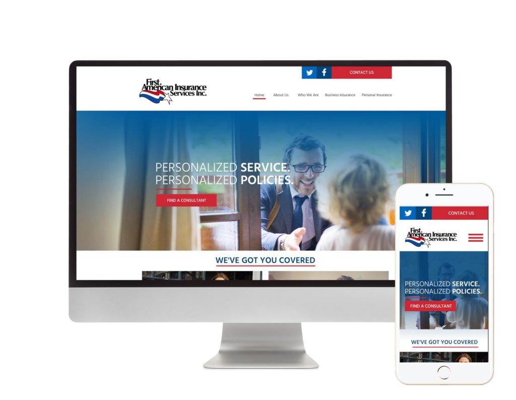
  • Ensure your website is uniform no matter what platform it’s accessed on (whether desktop, mobile, or tablet).
  • Ensure that your website is functional and easily usable no matter which platform it’s accessed on.

These are the main principles of the best practices as given by Google themselves.

A lot of their best practices can be boiled down to have a responsive design for your website. “Responsive design” means your website’s design adjusts itself depending on the size of the screen accessing it—so it’ll look uniform and coherent whether it’s a smart phone or a desktop connecting to your site.

There are also some more in-the-weeds aspects of web development and design that should be attended to. For example, the meta data and descriptions must be consistent between the mobile and desktop versions of your site. Other more technical parts of your site like structured data must also be consistent.

There’s a lot that needs to be checked if you’re trying to ensure your website is ready for mobile-first indexing. The easiest way to give a general check-up might just be to pull up your site on your phone or tablet:

  • Does the website still load quickly and smoothly?
  • Is the content (the text) all the same as the desktop version, and is it easy to read on a small screen?
  • Can you easily interact with the different menus and buttons?
  • Do images and videos still load effectively?
  • Are any ads on the site integrated without being too in-the-way?
  • Can you still find parts of the site easily?
  • Do all the links still work?

That’s a quick and dirty check-up on the mobile health of your website—a very important check-up under the new Google indexing system.

Ensure Your Site Is Usable and Beautiful on Mobile

Want to learn more about responsive design for your website? Need a check-up to ensure your website’s good to go for the future? Contact MLT Group today!


Use Responsive Web Design for Conversion Rate Optimization

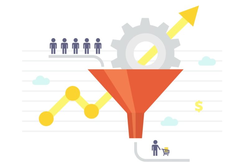
The conversion rate of your site is a measurement of how many users interacting with your web pages take the next step. Whether that means signing up for a newsletter, making a purchase, sharing a post, or any other engagement, an optimization of your conversion rate is a goal every website owner should have.

The most practical way to optimize your conversion rate is to build a responsive web design with user friendly interfacing tools and a clear-cut aesthetic. Conversion rate optimization (CRO) starts with a strong, simple website foundation that easily integrates the tools you need.


While everyone can benefit from conversion rate optimization, there are specific types of user engagement that website owners can generate with effective CRO tools. Common goals of engagement that website owners want to “convert” users to take the step into doing include making a purchase, signing up for a mailing list, following on social media, sharing information on social media, contacting your business, and even just clicking to another page. There are two main types of CRO that you can utilize to meet these goals of engagement with your site: primary CRO and secondary CRO.

Primary CRO: Direct interaction with your site

When users interact directly with your website, the factors that guide their interaction depend on how you build your site and the tools you provide to them. Much of this depends on design, comfort, and information.

Visual Interest

The visual features of your site are the first and foremost aspects of your website that users will engage with. Because it’s your front line of interaction, it’s very important to have a clear design that showcases your brand’s aesthetic

Gaining the interest of your targeted audience is the initial step to increasing conversion rates. Appealing visuals is part of that, but it’s also very important to build your site with a simple, intuitive design. Information should be clear to users about your site, products, and purpose, and it should be a natural experience for them to move from one page to the next. Piquing user interest and keeping it is the first step in increasing conversion rates with responsive web design.

Trustworthiness

The internet can be a dangerous place. Users want to feel safe when they interact with a website, and it’s up to the website owner to ensure that trust. Things like pop-up windows, obscured links, and ads can severely reduce conversion rates and damage your website’s relationship with users. Building in links, windows, buttons, and other design features that are transparent in their motives, easy to understand, and show they are secure is a sure way to increase conversion rates.

CRO doesn’t mean tricking users into engaging with your site. It’s a way to open the door for new and return users to build trusted relationships with your website and everything else you offer.

Accessibility

A big part of supporting your website’s trustworthiness is making it as accessible as possible to users. This means having a fast load time for all pages, a clean build without errors, high resolution, and a logical structure of information. It also means your website should have all the information your users need to know, from contact information to details on where materials are sourced and what other parties you work with.

Improving conversion rates depends on users being able to use your site as the tool you want it to be used as. Keeping a perspective on how accessible each new part you integrate into your site is key in supporting CRO.

Navigation

One way to better understand how accessible your site is to users is by considering the way they will navigate through it. Supporting CRO requires a good navigational system that lets users click through your site and find exactly what they are looking for as quickly as possible. However, it can also provide room for exploration through other parts of your site that could lead to another conversion rate different from a user’s initial search goal. Exploration with your site’s navigation system can happen before or after your user makes their first conversion.

Practically speaking, this can mean a suggestion for another product after a user puts an item in their cart, or it may be an opportunity for users to perform a broad search on your site that brings up many products meeting the search term.

Secondary CRO: General interaction with your brand

While the majority of the conversion rate analytics come from direct user interaction with your site, secondary reactions also play a big picture role in CRO for your brand. Interactions external from your site, such as social media and press, often lead to a more direct conversion in the future.

Social media

If you don’t have a social media presence on popular platforms, you are significantly limiting your conversion rate potential. Not only is social media a source of free advertising exposed to a global audience, it’s also a tool for you to build a community around your brand.

For many site owners, too, social media is a way to humanize a commercial enterprise while showing constant news updates that may otherwise be unworthy of a full press story. For example, many use social media to show the staff involved, processes used, and other “behind the scenes” information.

Implementing all of these uses of social media for CRO and saturating multiple platforms with your brand profiles creates countless opportunities for backlinks to your website. Links directly from your profiles or from followers and similar brands are a large contributor to direct website traffic and increases in conversions.

Newsletters

Another common secondary interaction with your website and brand is a regular newsletter. Establishing a mailing list sign-up option on your site will let you collect a fan base that includes users who do not use social media or who want more in-depth information and updates about your business. Links through your newsletter bring users to your site where direct interaction and conversions occur.

Targeted Ads

As a website owner, you know what types of users your audience includes. An effective way to spread your website’s presence to new users is with targeted ads. Targeted ads are especially useful for finding new users on social media. In fact, many targeted ads are only activated through social media platforms.  Users clicking on targeted ads are more likely to lead to a conversion because those users are open to interacting with an advertisement in the first place. Ads can seem untrustworthy, and users tend to stay away from them unless there is genuine interest.  Be smart with your ads!

Community

Depending on your brand, you may be able to generate a real community around what products or services you offer, nonprofit actions you perform, or whatever else your website showcases. This community is built on various tools including social media, newsletters, and ads. Bringing together people who support what you do builds a natural support system for CRO. For many website owners, testimonials and anecdotes are some of their most persuasive elements for conversion. If you see a community forming around any aspect of your site, no matter how small, don’t underestimate disregard it. Foster community with interaction and content.

Build a Responsive Website

Implementing some or all of these CRO tools is an option for many website owners. These tools provide a standard for responsive web design formulated around CRO, but there may be other techniques unique to your own website you can use. MLT Group LLC can help you generate new ideas while utilizing tried and true methods for CRO and responsive web design.

Contact us today!